
anagram books
London, United Kingdom and Berlin, Germany
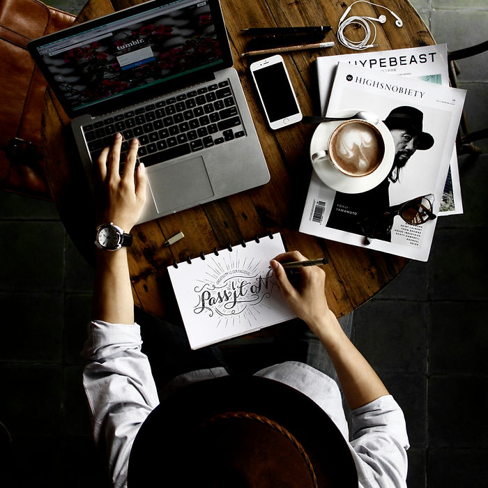
the challenge
Anagram books needed to stand out from a crowd she was new to.
the solution
We provided a top user experience for this ecommerce using many tools to allow the client to browse efficiently the inventory or to just easily find a previous order to reorder quickly. This website was thought through with the target audience habits in mind.
material produced
strategy, logo, business cards, tote bag, video, website
credits
Creative direction and design Stephane Bee
Production Sheila Lawson


WHAT PEOPLE SAY
"Stephane Bee has done an excellent job on our website, she researched thoroughly our business, asked all the right questions in terms of what the website should be able to do and why, and came back with a friendly platform for users, easy to navigate and pleasant to browse. We have had much positive feedback on her work from our customers and colleagues and we would highly recommend her for her professional expertise and openness to adapt the design to provide us with a useful (and handsome) tool to work with. She also worked on our logo. She's experienced, professional, efficient and very pleasant to work with to boot! I couldn't recommend her services higher for anyone who wants and good looking and smart website design."
— Adeline Mannarini, Founder


lark.
Brooklyn, NY
the challenge
Lark's vision was very contemporary and modern yet with an artisanal touch. This concept applied both to their interior design – warm balance of wood, metals and modern colors such as grey and lemon yellow.
the solution
They wanted the logo to represent the bird "lark" so I developed a bird that was both modern and yet had a hand drawn touch to it. The multiple lines also define the multiple activities offered by the space.
material produced
strategy, logo, business cards, frequent buyer card, promo cards, tote bag, stamp, mugs, paper bags, window signs
credits
Creative direction and design Stephane Bee


WHAT PEOPLE SAY
"We worked with Stephane to develop a logo for our cafe and were blown away by her work. She was able to combine two distinct personalities and design aesthetics to create a bold, unique logo which represented both of us as co-owners/business partners. Most importantly, it represented the look and feel of the cafe we were opening.
Stephane is an incredibly talented and creative designer and we would recommend her without hesitation!"
— Kari Browne, Founder


gluckigluck
Berlin, Germany
the challenge
Sophie needed a powerful booth at a tradeshow in Paris to introduce her product to the French market. She believed that the gluckigluck vase/carafe spoke for itself and wanted a global ad campaign highlighting the noise the vase makes once water is poured from it.
the solution
The POS created was a series of posters introducing each color offered associated to different languages using "I gurgle" as a slogan. This was the kick-off the success of the brand.
material produced
logo, business cards, shopping bags, paper bags, POS, window sign, advertising posters, strategy
credits
Creative strategy and design Stephane Bee


WHAT PEOPLE SAY
“Stephane got immediately what I wanted. She realized that on the biggest and busiest European design fair “Maison Objet" one had just a few seconds to catch new merchants.
So she designed these genius posters, pure, clear of any distraction and convincing.
The only two words she added expressed the one unique selling point of my product. Can it get any better? Needless to say: 30 new accounts during one show!"”
Followed the store, the rest is history
— Sophie Mahlo, Founder, CEO


plein pot
Lausanne, Switzerland
the challenge
A previous client contacted me in regard of a new venture business he was starting. He decided to turn a hobby - cooking - into a side business. He needed a name and a full visual identity.
the solution
After much brainstorming I came up with "plein pot" which means "full jar" but also full on (fast and furiously successful) described well Thibault's personality but also gave room for the company to grow without locking him in the "condiments" aisle. I used a "full" typeface with a jar as the "O" of "pot". Simple and effective.
material produced
strategy, logo, business cards, tote bags, labels, tags, store sign, advertising posters, landing page
credits
Creative strategy and design Stephane Bee


— Sophie Mahlo, Founder, CEO


WHAT PEOPLE SAY
As I was transitioning career path I needed a new visual identity for my new activity. One more time Stephane found the perfect design to match my products, style and ideas.
It's not the first time that I successfully work with her and would gladly do it again!
— Thibault Roulet, Founder, Chef, Culinary magician

antoine
vidal
Paris, France
the challenge
Antoine Vidal, a succesful Parisian sculptor needed a visual identity and an online support to promote his new exhibit "Postures".
the solution
A playful logo both reminiscent of his initials and his sculptures.
material produced
A playful logo both reminiscent of his initials and his sculptures.
credits
Creative strategy and design Stephane Bee

WHAT PEOPLE SAY
"What a great job! I needed to reformulate a PDF in an online deck to present my sculptures. Stephane understood everything!
he was very efficient!
It is very successful, ergonomic and consistent"
— Antoine Vidal, Sculptor


free2move
Berlin, Germany
the brief
Banner , Carousel or Slideshow ; Video (up to 15 seconds, 4GB max)
Range car sharing and mobility app; Target group men between 25-40
Goal (call-to-action) Download the app!
Message All car sharing providers in one app
the ideas
Banner: Focusing on the main sport event of June-July 2018: The World Cup. The message delivered is that the user can go out, enjoy a night out with friends at a popular Berliner venue to watch the World Cup outdoor and be back home on time to get enough sleep for the next day’s meeting.
Carrousel: a serie of posters both use digitally on print, work alone and a serie, highlighting the benefit of using Free2move in a whimsical way
material produced
strategy, video campaign storyboard, digital campaign, print campaign
credits
Creative strategy and design Stephane Bee


verbalon
Paris, France
the challenge
Sacha and Yannick took over the management of le "Verbalon" a typical little Parisian brasserie in the 13th district and needed to make it their own.
The font of the name could not change as the owner was not willing to change some of his collateral material. Yet they needed their audience to understand that it had been a shift and that the restaurant was aiming for a more diverse and dynamic clientele. Yannick was very keen on having an actual glass ( a verbalon is a typical type of wine glass).
the solution
My design sensibility is never much towards literal design. I was able to create the illusion of a glass by using a simple line to draw the silhouette of a verre-ballon. I also removed the "tail" which was on the "A" of Verbalon as it did not have a clear purpose and was poorly executed. The team and clientele were ecstatic about the result.
material produced
strategy, logo, business cards, menus, wine labels, awning
credits
Creative strategy and design Stephane Bee


WHAT PEOPLE SAY
“ Stephane Bee was able to successfully create the new image we needed for the restaurant to differentiate ourselves from the previous owner. We could not be happier with the result, we are thrilled. The logo represent us like hand and glove: sober, clear, aesthetic and creative. The clients noticed the new identity right away and positively approved!
— Sacha Lucas and Yannick Gasnier, Restaurant Managers
AGT
Global
the challenge
AGT International was already signing billions in contracts when they decided that they need the visual communication for their 10 to be created with a very fast turnaround.
the solution
We achieve a strong logo by merging the idea of the globe (international) and the shield (security) to embrace the two most important aspect of their business. We use the same approach for all the companies while embracing the local culture and sometimes specific request from the CEOs.
material produced
creative startegy, communication, logo, stationery, memos,
branding guidelines, digital strategy, videos, brochure, press
releases template, HR job offer templates, emails template, powerpoint templates and presentation, and advertising
credits
Global Creative direction, concept, production and design Stephane Bee
Video Art direction UVPH
Video Design and animation UVPH
Design Amber Zezeck
Copy Alice Dontanville, David Greenky, Moira Murphy-Cairns


WHAT PEOPLE SAY
“Bee is fast, effective, focussed and creative. Super to work with and magnificent experience”
— Prince Peeter-Christiaan van Oranje,
CEO of Custodia Holland Group
Stephane is communicative and talented, having had extensive experience in the past. Clearly understands the importance of strategy when building brands. She also has a hands on mentality which together makes her all around branding professional.
— Zeljka Davis,
Global VP Corporate MArketing and Branding


arabesqueS
Genève, Switzerland
the challenge
Marie-Caroline reached out to me as she started her coaching agency. She needed a visual identity and a name.
the solution
Dance was a key element for the client, a good metaphor for self-development. The name “Arabesques” came naturally. The Arabesque position was a great departure point for the development of the logo. One foot as an anchor and one used for soaring. I also wanted to merge the "A" of Arabesques with the position and the keywords given to me by Marie-Caroline: balance, sense of direction, anchorage. The logo needed to represent both the A and an arabesque without being literal. I traced the different lines of the arabesque and rotated them slightly in order to make the "A" a little more obvious.
material produced
name, logo, stationery, bookmarks, website
credits produced
Strategy, creative direction, design, web design Stephane Bee
Copy and proofreading Delphine Blanchard


WHAT PEOPLE SAY
"Stephane Bee is an inspired designer, a real artist, mixing acute intelligence, insight and efficient technical know-how : the result of her work went far beyond my expectations.
When I asked her to create the communication for my new practice (cards, paper, website etc.), she started by carefully listening to me, by asking me questions about what I wanted to transmit, by asking me words that defined my work.
A few days later, she proposed me a logo that deeply moved me in the sense that she captured something that went beyond my words, something like the essence of what I want to transmit. Her creative process is fascinating.
She is a great professional that could give me sound counselling on all the medias, while always letting me have the final choice. Working with Stephane Bee has been an exciting adventure and I strongly recommend her.
— Marie-Caroline Bertoldo, Founder, Life Coach
